I have been researching photographers to get ideas for my project and decode how to create my multiple image. I mostly got inspired but Paul M. Smith but i also found another photographer that inspired me. The photographers name is Sarah Ann Loreth and the picture of hers that inspired me is this one :
I believe that there is more that one way to create this photo and the ghost - like effect. She had either used slow shutter speed and just walked from one place to the other, which would mean that where she's blurred, she just stood there for few seconds, whereas where you can see her perfectly clear she stood there for way longer than in the other positions.
She also could have taken the photographs for each position she's standing in and then developed it and layered it in Photoshop using the photograph with her standing in the middle as a background photo. The she would have turned the opacity of the other layers down to create the ghostly effect.
What inspired my in this image is the mysterious mood it has, and what makes it even more mysterious is the location where the picture is taken. It looks like its a hall way of an old school or abandoned hospital. The dark corridor and the low light coming form the dirty windows along the hall make the image look scary, which goes with the ghost theme that in my opinion artist was trying to create. There aren't many colors in the picture but that makes the girl in the photo stand out even more, even though it seems like she was trying to blend in wearing white dress, which goes with the windows and covering her face with her black hair which fit in with the dark sealing and the wall at the end of the corridor. The composition in this picture is mean to be specious as she's not really at the fore ground or the background, she's precisely in the middle which gives us enough room to look at the old broken floor and kind of see the background through the blurred silhouette.
Unfortunately when i found this photographer and her photo I had already done my multiple image and there was no more time to create a new one. It doesn't bother me too much because I was quite happy with my final photo. Whereas it is still something I would like to have a go at doing in the future.
Anita's Photography
Monday, 14 May 2012
Sunday, 19 February 2012
Edit of my final picture
 The first thing I needed to do was to open up Photoshop and then upload the picture I'd use as my background. To upload the photo I pressed on 'File' and then 'Open' and the picture I sued as mu background is this one:
Next, to add another photo I went to they folder I had my pictures in, found the photo I was going to use, clicked and drugged it to Photoshop. The picture shows how my layers looked like.
The picture completely covered my background so I had to turn the 'Opacity' down so that I could see the other image and move it around so that it fits with the background. And this is what it looked like:
Next step, I went on layer tab and pressed 'Layer Mask' and pressed 'Reveal All' which changed what my layers look like too.
Now I pressed paint brush on the toolbar on the side with the colors black and white at the bottom. At the left top corner of Photoshop I changed the size of my brush to the size that was suitable for me. Then I started painting over the figure carefully so it doesn't mix up with the rest of the picture. If the mistake is done however, you can easily fix by reversing the colors by pressing the little arrow.

I learned this technique by looking at the way m classmate did her work. This helped me a lot and all the credit goes to Becky for what I did so far :).
I realized afterwards that I can't or don't know a way to put another picture into layers without having to paint over the two figures again. Therefore I saved the picture as a JPG. and then opened the saved picture in Photoshop and did the same tactic all over again till I got my final image. I also had to think about the shadows on the picture when editing to make sure they're there and so that it looks more realistic. Also when the image was finished, I did one more piece of editing which was to just change the contrast a little bit.


Shoot
I came up finally with the idea of what to shoot. The photo shoot was done in my living room of my nearly four year old sister, dressed up as a princess, a fairy and a cute kitty cat. On the pictures she's reading books and is dressed up in different costumes then the theme for it could be 'Child's imagination'. Here are few photos I took:
And here are the pictures I choose to edit for my final picture:
Friday, 17 February 2012
Planing
Looking at my research,, I have decided how I want my image to look, but I still needed to think of a good theme to it.
So I decided that in my image I shall have a model playing different characters. I liked the idea of the depth-of-field, so that its not all in focus. Depending on whether I will be shooting outside or inside I shall take photos with and without the flash to have more options to choose from. Edit ones with flash and without and compare them, possibly both can come out quite interesting. Also the composition in my picture I want to be different positions and have my model all over the place.
So what the theme of my image should be? Looking at my composition and ideas it could be anything. Hopefully I can try to make fairy tale theme, as I saw some examples and I really liked them. But something else might pop up to my mind for and idea and I'll change the theme foe something completely different. So what will it be? Time will show!
Multiple Images Research
Paul M. Smith
I my research I looked at the photographer called Paul M. Smith and I found inspirational photographs of his. One that I really liked was one form album on his website called 'Artist Rifles' and the photo is:


Lighting
Again, the lighting in this photo has to be done carefully to make it look perfect and real. The man right at the front of the picture eating kebab is what we're looking at yet he's out of focus but the figures being him are not.
Composition & Theme
They're all over the place having some fun.
Inspiration
I like the idea of out of focus close up picture.
Coloring
The colors here are pretty dark except the places that the flash touches.
Combine those two pictures together and I have an idea and rough image of what my picture is going to look like.
I my research I looked at the photographer called Paul M. Smith and I found inspirational photographs of his. One that I really liked was one form album on his website called 'Artist Rifles' and the photo is:
Inspiration
What I like about this photo is that has one model but he's playing different characters.
Theme
The background in the picture looks quite peaceful even though the theme of it is war.
Lighting
When Paul took these pictures outside I suppose he must have used a reflector to get the lighting in the picture right so that it looks realistic, as the weather can always change and so will the lighting.
Composition and Coloring
The figures are pretty much centered in the middle of a frame.
Different characters bring attention to the viewer as they're trying to guess their role. The picture represents the scene in the middle of green field with bright grey sky in the back, which tells us that it's morning. The camouflage clothes, go with the green field.
Another piece of his work that I liked comes form an album 'Make My Night'
Lighting
Again, the lighting in this photo has to be done carefully to make it look perfect and real. The man right at the front of the picture eating kebab is what we're looking at yet he's out of focus but the figures being him are not.
Composition & Theme
They're all over the place having some fun.
Inspiration
I like the idea of out of focus close up picture.
Coloring
The colors here are pretty dark except the places that the flash touches.
Combine those two pictures together and I have an idea and rough image of what my picture is going to look like.
Friday, 9 December 2011
Landscape film noir photos
Here are few more pictures I took, which i didn't use in my timeline nor my poster.
This is more Sin City style photo as its not just Black & White but it also has strong red lipstick color and a cigarette being lit up.
A lonely woman sitting by the table.
It seems in this picture as if she was looking at someone.
She looks terrified.
Here she's screaming, but the mystery is... Is this really happening or is that just her mind playing tricks on her?
She looks deeply into the darkness as if she was expecting something or someone come out of there.
And here it is in color.
Editing of my poster.
The original photo I started with and the edited bits.
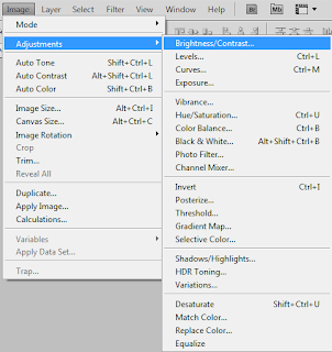
 I opened up the picture in Photoshop. The first thing I always do before editing the picture is change the brightness and the contrast of it. So I went on Image and Brightness/Contrast. When I pressed the a little window showed up. I changed the settings and came up with the 2nd photo.
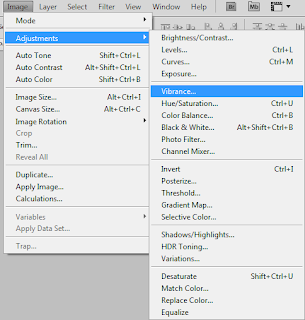
 The next thing I did was to go on Image and press Vibrance where a a little window showed up with settings. I changed it till the point I was happy with my picture and went onto the next step.
 I opened up the picture in Photoshop. The first thing I always do before editing the picture is change the brightness and the contrast of it. So I went on Image and Brightness/Contrast. When I pressed the a little window showed up. I changed the settings and came up with the 2nd photo.
 The next thing I did was to go on Image and press Vibrance where a a little window showed up with settings. I changed it till the point I was happy with my picture and went onto the next step.
My next step. I go in Image once again, this time scroll down to the Black & White section and my image looked like in the image four (second line, first picture). The window would showed up, then i would change the settings and it would look like the second picture in line two.
I only changed the settings in the first two lines since mostly those colors are dominating in the photo. Next one easy step to make the picture brighter and cleared i used the Dodge Tool and the 1871 size square brush. Three strokes from top to bottom and it looks perfect!
To finish off the poster I cropped the image and added title and tagline.The very last thing I had to add was the 18 + rating. That's all.This is actually the technique I used to edit all my Film Noir photos. I found editing the pictures really useful for my photography skills as I learned few tricks using Photoshop I didn't knew before and finding my own way to make the pictures look the way they're meant to look makes me feel more accomplished. As a photographer, I also now have an additional perspective in taking photographs, now knowing the additional effects I can apply later.
Subscribe to:
Comments (Atom)


